Introducing our Click2Go No Drill Blinds
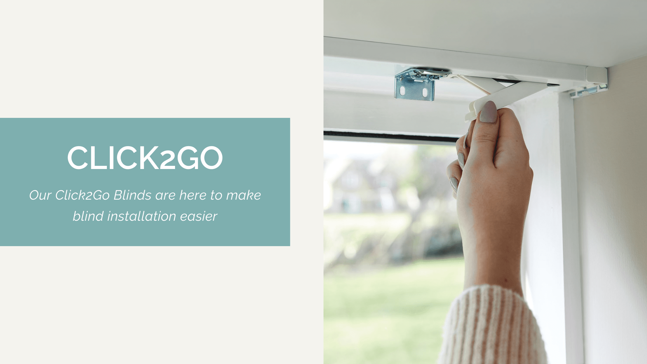
We are thrilled to introduce our Click2Go collection of no drill blinds that revolutionises how we shade our homes. Our Click2Go system makes the installation


We are thrilled to introduce our Click2Go collection of no drill blinds that revolutionises how we shade our homes. Our Click2Go system makes the installation
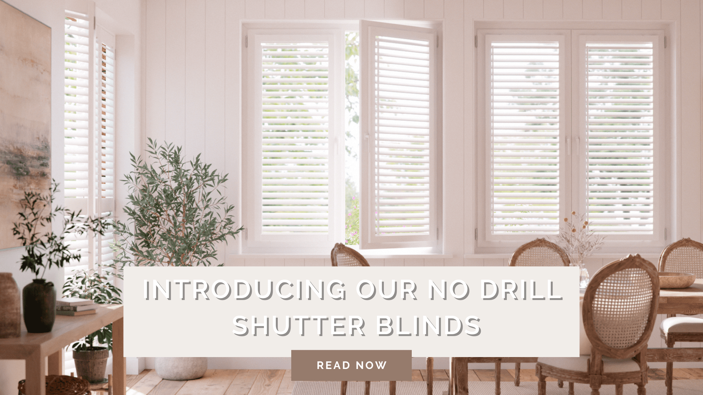
Want hassle-free shutter blinds installed in minutes? Our no-drill PerfectFIT Shutter Blinds are the solution for you! Even though we’ve made installing our Shutter Blinds
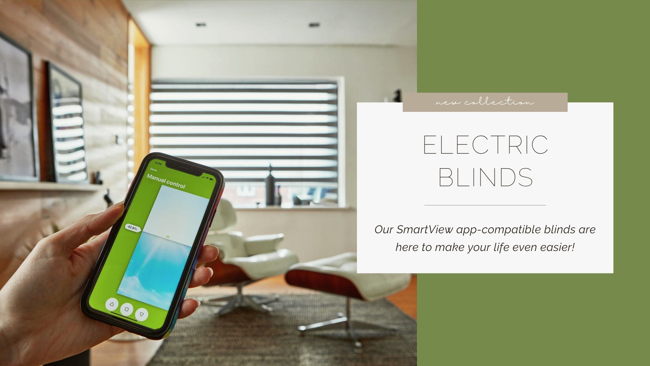
Our electric blinds are the ultimate in convenience and style! Perfect for updating your home, control and automate your blinds effortlessly from your smartphone using
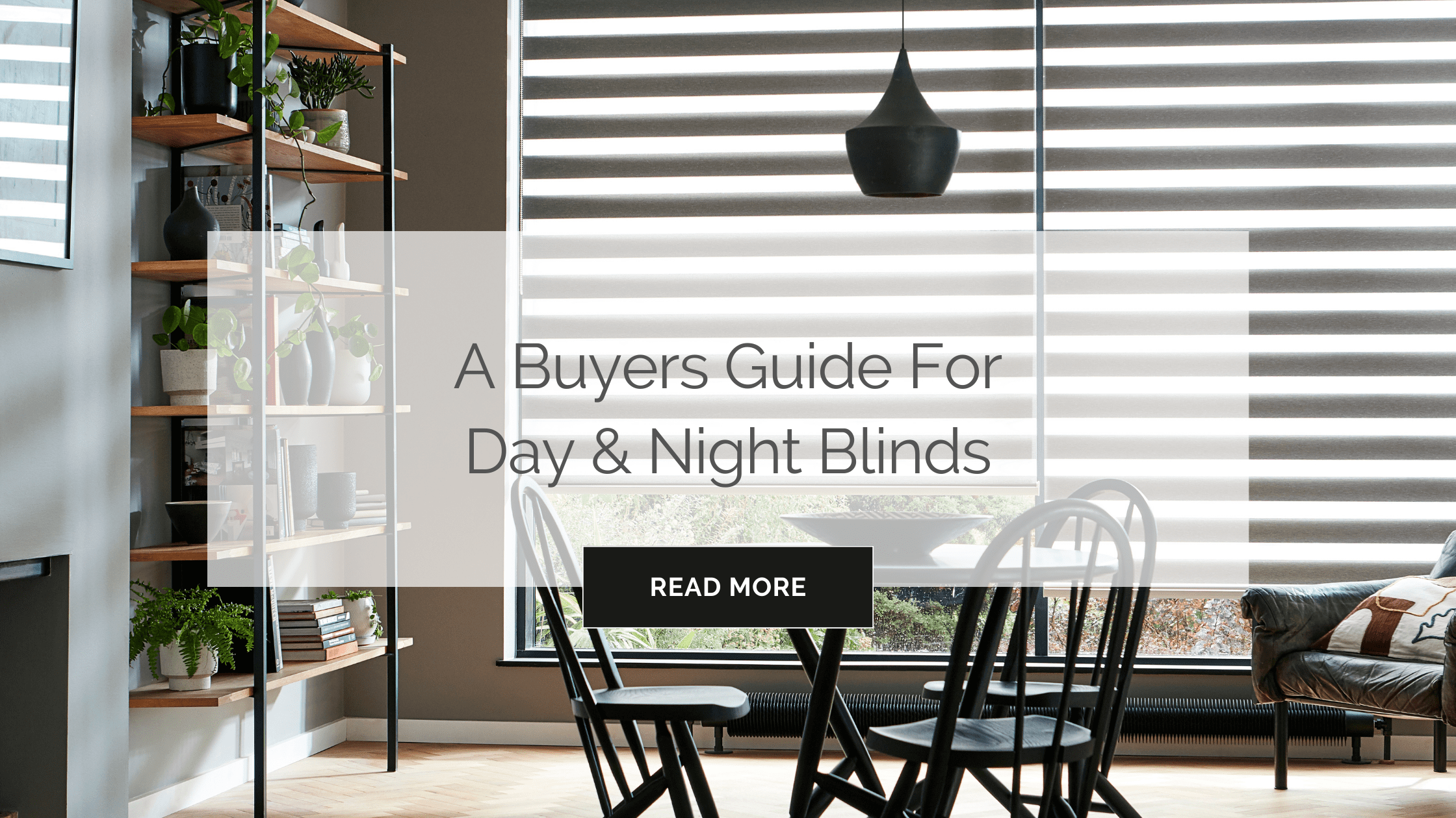
What Are Day & Night Blinds? Day and Night Blinds consist of two layers of a blackout and a light filtering material on a single fitting.
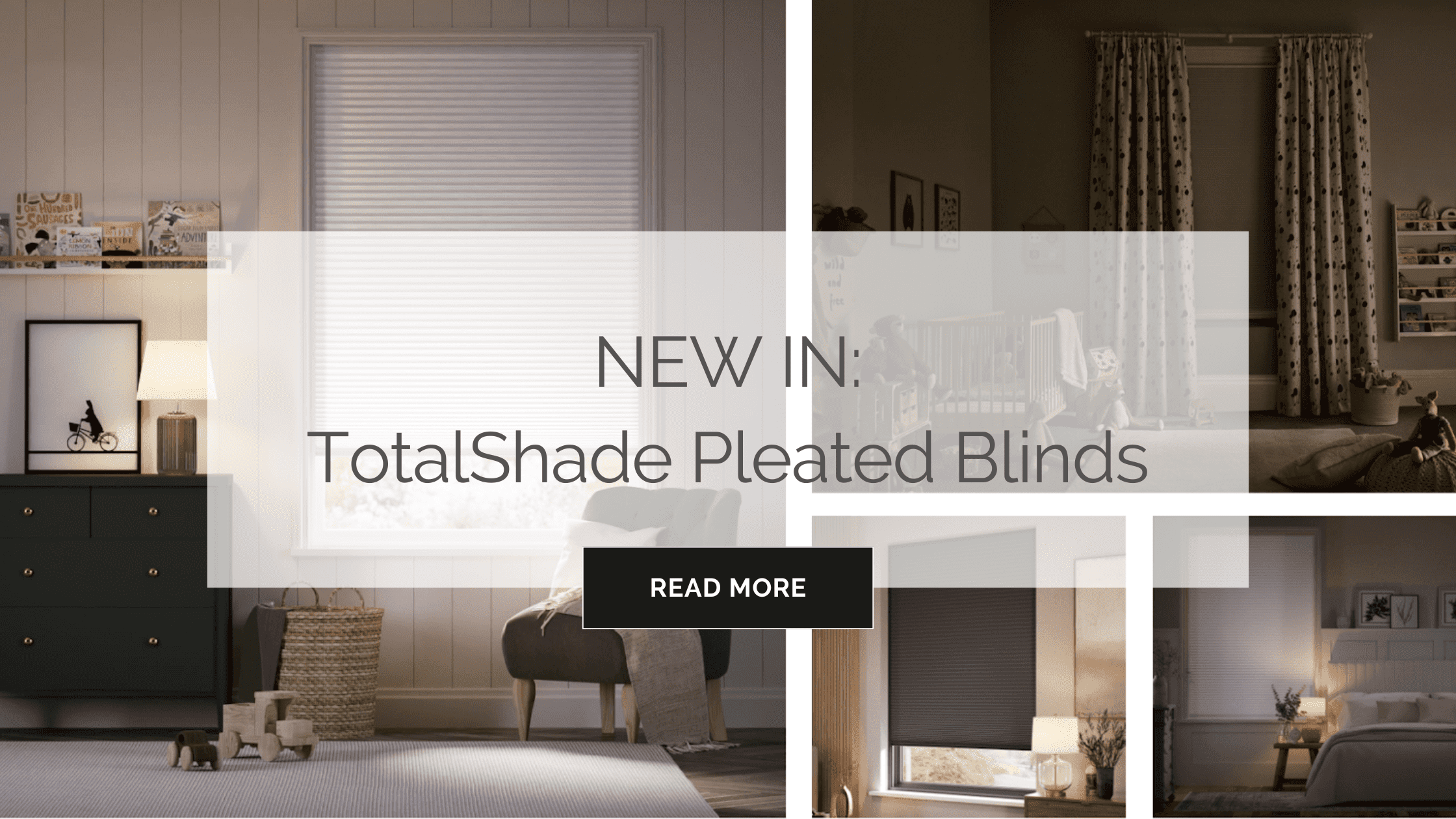
We’re thrilled to announce the launch of our brand new TotalShade Pleated Blinds! Made from light-blocking and energy-saving DuoShade fabric, which is housed in a

What Are Skylight Blinds? Skylight Blinds, also known as Roof Blinds, are made to specifically fit your roof windows based on your window design. Featuring